Skin by Sakhshi
Skin by Sakhshi
Skin by Sakhshi
A website for a makeup artist, offering easy client contact
A website for a makeup artist, offering easy client contact
A website for a makeup artist, offering easy client contact
YEAR
2024
CLIENT
Sakhshi Sabhaney
PROJECT TYPE
Website Design
role
UI & UX Designer

CONTEXT
CONTEXT
CONTEXT
Introducing a strategic perspective to ensure content stands out
Sakhshi reached out to me because she was dissatisfied with her existing website. She wanted a fresh, cohesive upgrade that would highlight her artistry while being simple enough for her to manage independently after the project was complete.
THE PROBLEM
THE PROBLEM
THE PROBLEM
Lack of clear purpose and design thinking
The website lacked a cohesive design system, with inconsistent styles, unclear hierarchy, and poorly executed layouts. Created without a solid understanding of design principles, the site made it difficult for Sakhshi to effectively showcase her work and attract potential clients.
THE CHALLENGE
THE CHALLENGE
THE CHALLENGE
To transform an inconsistent, unstructured website into a professional platform that focuses on highlighting the makeup artist’s work, allows for potential clients to reach out, and simplifies management for a person without a design background.
DESIGN METHODOLOGY
DESIGN METHODOLOGY
DESIGN METHODOLOGY
The Three C’s: Client, Concept, Completion
The Three C’s: Client, Concept, Completion
The Three C’s: Client, Concept, Completion
A client-focused approach while ensuring user needs are always prioritized.
Client: Empathize & Define
✔️ Prioritizes Client Goals
✔️ Prioritizes Business Objectives
✔️ Addresses User Needs
Concept: Design & Develop
✔️ Manageable, Streamlined Process
✔️ Ensures Efficiency in Task Flow
✔️ Ensures Efficient Collaboration
Completion: Test & Deliver
✔️ Credible Client
✔️ Polished Deliverable
✔️ User Satisfaction

CLIENT: EMPATHIZE & DEFINE
CLIENT: EMPATHIZE & DEFINE
CLIENT: EMPATHIZE & DEFINE
Understanding the Client's Goal
Understanding the Client's Goal
Understanding the Client's Goal
Daily discussions with Sakhshi revealed her need for a website that:
- Balanced artistic expression with professional polish.
- Featured a bold design that attracted clients without overshadowing her work.
- Eliminated the need for advanced design expertise and HTML/CSS knowledge required by her existing Squarespace site.
- Simplified website management.
- Drove client inquiries.
- Maintained navigation where every item had its own separate page, instead of combining different types of information onto one page.
Key Insight:
- Despite adding her Instagram handle in the footer, she received very few inquiries via her site.
Design Decision:
- The new site focuses on the inquiry process through a streamlined contact form.
Understanding the User's Needs
Understanding the User's Needs
Understanding the User's Needs
Given the website's focus on visual appeal, I sought input from a variety of sources. I interviewed 2 potential users, 2 fellow designers, and 2 individuals interested in specific content types like Reels and Lookbooks. Sakhshi also shared valuable feedback from her network of photographers, makeup brands, and model houses, providing insights into their expectations for a professional makeup artist's portfolio.
Key Insights:
- Models and Photographers looked for high-quality images that reflected the makeup artist's ability to adapt to different aesthetics.
- AD Directors and Brands wanted to see a makeup artist's success stories or clientele before committing.
- Stylists wanted a fast, but professional way to contact Sakhshi.
- Overall, the users were more likely to take the website seriously if it was visually appealing.
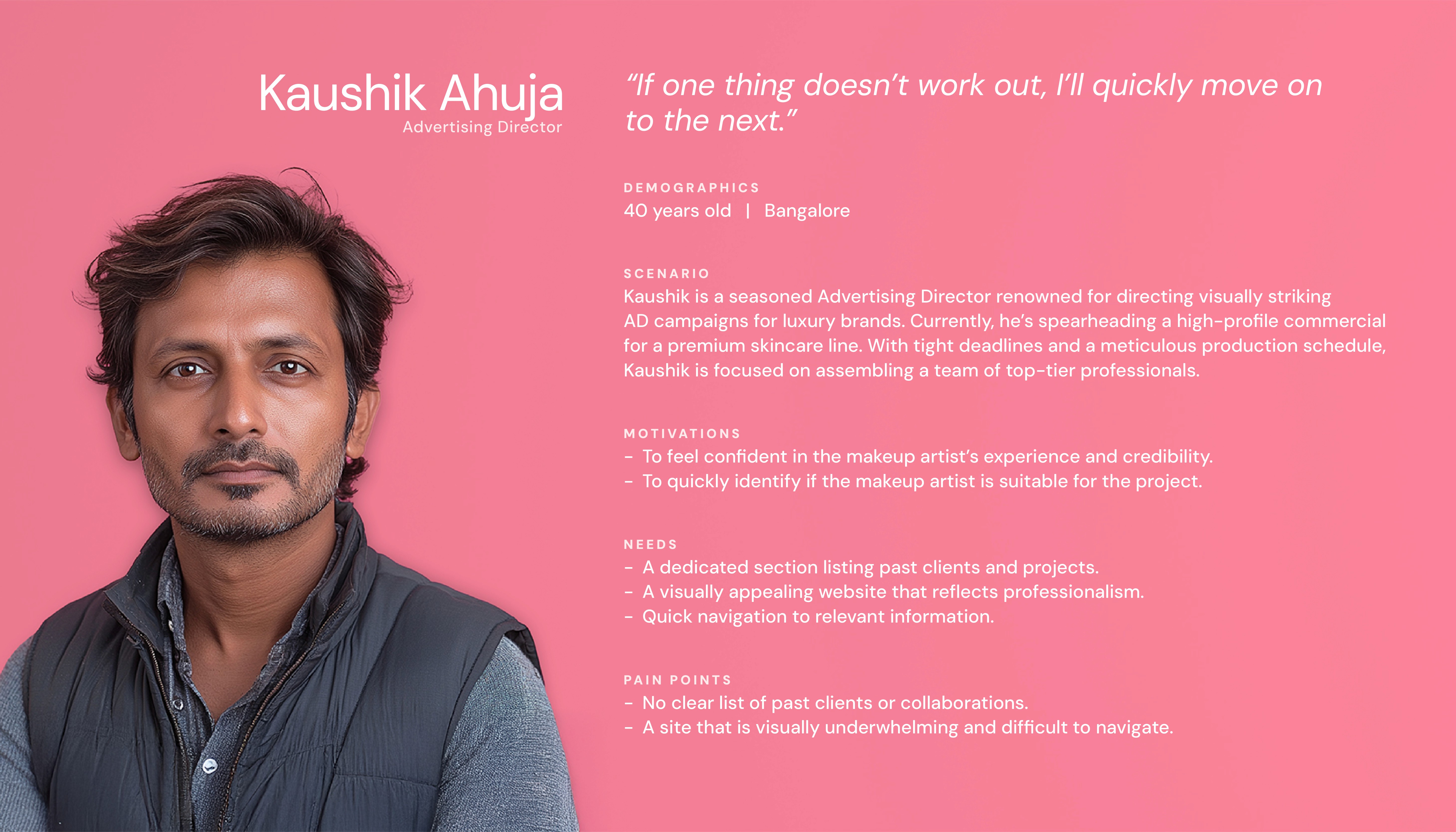
Based on the findings, I categorized the insights and pain points into four distinct user personas, each representing a unique use case.
Given the website's focus on visual appeal, I sought input from a variety of sources. I interviewed 2 potential users, 2 fellow designers, and 2 individuals interested in specific content types like Reels and Lookbooks. Sakhshi also shared valuable feedback from her network of photographers, makeup brands, and model houses, providing insights into their expectations for a professional makeup artist's portfolio.
Key Insights:
- Models and Photographers looked for high-quality images that reflected the makeup artist's ability to adapt to different aesthetics.
- AD Directors and Brands wanted to see a makeup artist's success stories or clientele before committing.
- Stylists wanted a fast, but professional way to contact Sakhshi.
- Overall, the users were more likely to take the website seriously if it was visually appealing.
Based on the findings, I categorized the insights and pain points into four distinct user personas, each representing a unique use case.


Deconstructing the Existing Website
Deconstructing the Existing Website
Deconstructing the Existing Website
A heuristic evaluation uncovered several usability issues, the visual chaos detracting from Sakhshi’s professional image:
- Consistency and Standards:
The website lacked uniformity in typography, proportions, colors, and layout, leading to a disjointed user experience. The logo was not clickable, and the landing page was listed along with the other pages in the navigation menu.
- Aesthetic and Minimalist Design:
Excessive clutter and the inconsistent margins and gutter spaces made the website overwhelming and difficult to navigate. Page headings were barely visible against stock photographs.
- Visibility of System Status:
Some pages lacked clear headings, relying on small text placed between large images, making it difficult for users to identify important content.


HYPOTHESIS STATEMENTS
HYPOTHESIS STATEMENTS
HYPOTHESIS STATEMENTS
Formulating Assumptions for UX Improvement
Formulating Assumptions for UX Improvement
Formulating Assumptions for UX Improvement
- If the website clearly highlights Sakhshi's ability to adapt to different styles and aesthetics, then the model will feel assured of her capabilities in helping come up with unique makeup looks for her own modelling shots.
- If a fashion brand can browse a well-organized gallery of high-quality images that highlight the artist’s expertise, then they will feel confident in hiring them to create an impactful lookbook for their brand.
- If the website showcases Sakhshi's experience through client lists or success stories, then the AD Director will see her potential to bring their vision to life.
- If stylists can easily get in touch with Sakhshi through a clear and accessible "Contact Me" form, then they will feel more inclined to reach out for inquiries or bookings, reducing barriers to communication and increasing potential collaborations.
VALUE PROPOSITION
VALUE PROPOSITION
VALUE PROPOSITION
The redesigned website will showcase Sakhshi’s expertise and personality through a bold, polished, and user-friendly design. It will offer an intuitive experience, highlighting her plethora of work and making it easy to connect for inquiries. By prioritizing clarity, consistency, and a strong purpose, it will address user pain points like difficulty getting in touch, or evaluating professionalism.
The redesigned website will showcase Sakhshi’s expertise and personality through a bold, polished, and user-friendly design. It will offer an intuitive experience, highlighting her plethora of work and making it easy to connect for inquiries. By prioritizing clarity, consistency, and a strong purpose, it will address user pain points like difficulty getting in touch, or evaluating professionalism.
The redesigned website will showcase Sakhshi’s expertise and personality through a bold, polished, and user-friendly design. It will offer an intuitive experience, highlighting her plethora of work and making it easy to connect for inquiries. By prioritizing clarity, consistency, and a strong purpose, it will address user pain points like difficulty getting in touch, or evaluating professionalism.
CONCEPT: DESIGN & DEVELOP
CONCEPT: DESIGN & DEVELOP
CONCEPT: DESIGN & DEVELOP
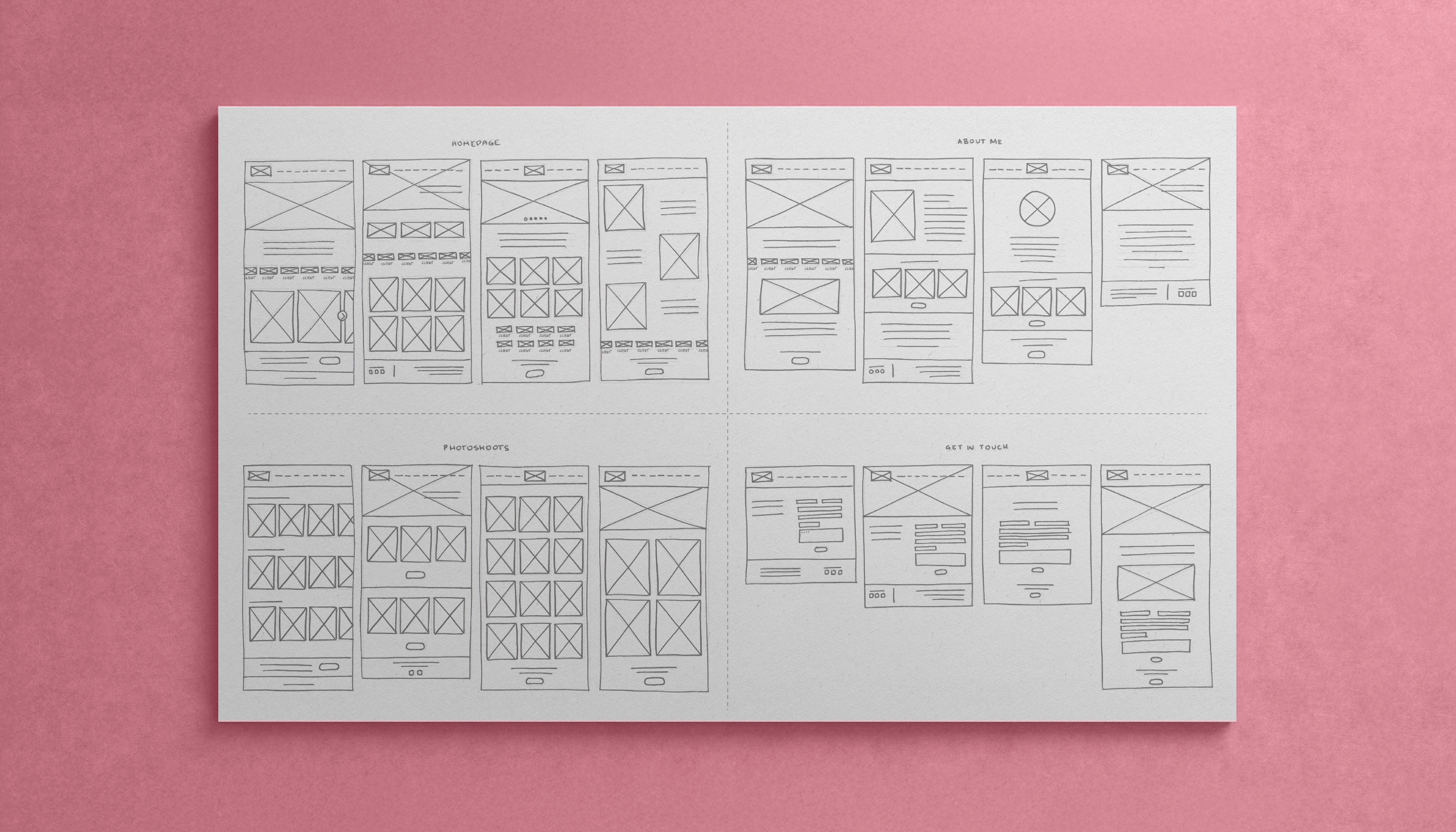
From Sketches to Wireframes
From Sketches to Wireframes
From Sketches to Wireframes
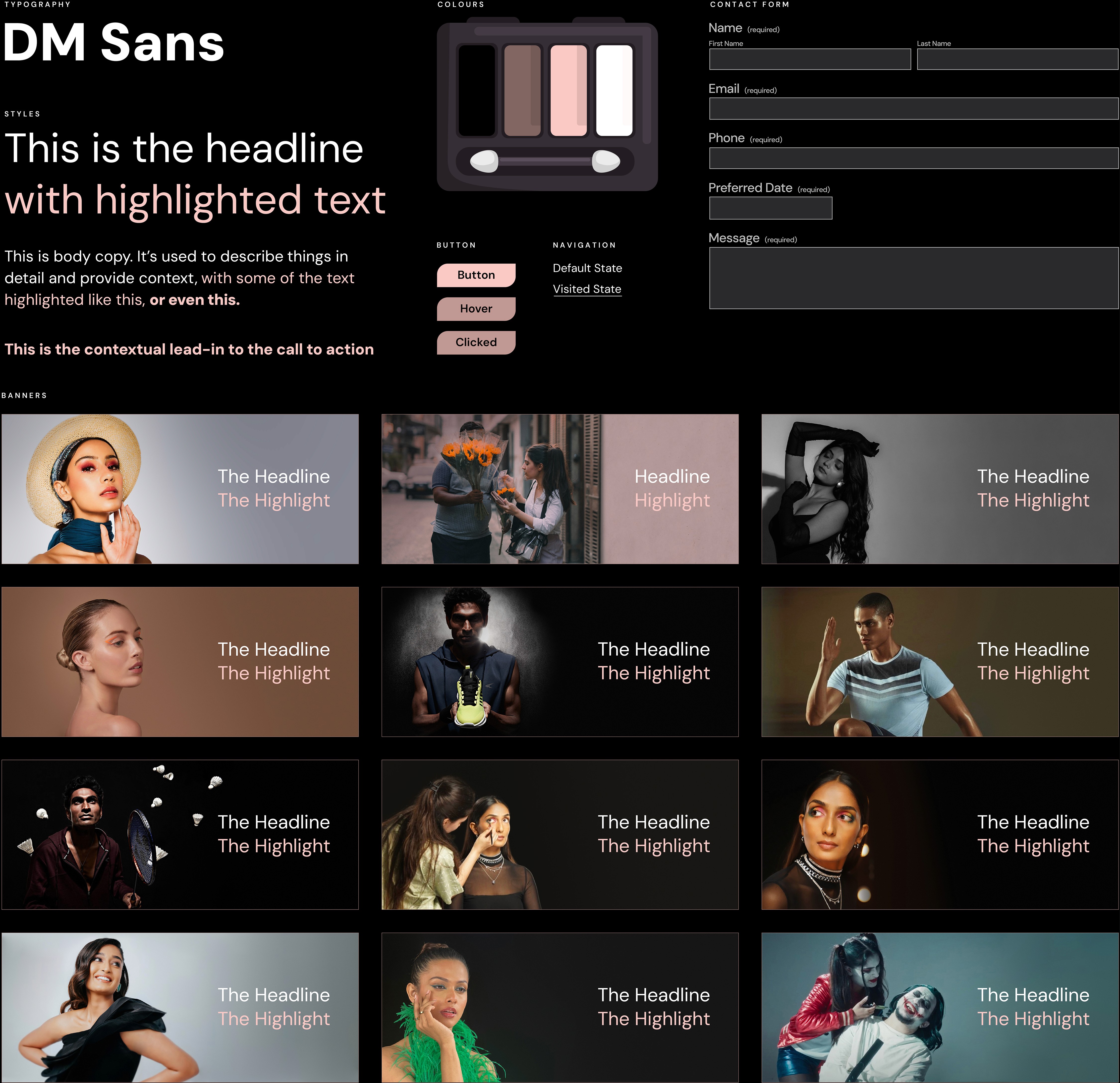
The design and development phase was guided by a clear value proposition and a set of core principles: aesthetic usability, purpose, consistency, authenticity, simplicity, and contrast. I began with Information Architecture, then sketched multiple layout options for the pages. After further discussions with Sakhshi, I moved on to digital wireframes. From there, I explored various design concepts, using the core principles as a lens to evaluate and refine my ideas.
The design and development phase was guided by a clear value proposition and a set of core principles: aesthetic usability, purpose, consistency, authenticity, simplicity, and contrast. I began with Information Architecture, then sketched multiple layout options for the pages. After further discussions with Sakhshi, I moved on to digital wireframes. From there, I explored various design concepts, using the core principles as a lens to evaluate and refine my ideas.
The design and development phase was guided by a clear value proposition and a set of core principles: aesthetic usability, purpose, consistency, authenticity, simplicity, and contrast. I began with Information Architecture, then sketched multiple layout options for the pages. After further discussions with Sakhshi, I moved on to digital wireframes. From there, I explored various design concepts, using the core principles as a lens to evaluate and refine my ideas.


A Responsive Design
A Responsive Design
A Responsive Design
The scope of the project included making sure the website was fully responsive across different devices. Since I was working with Squarespace, there was no need to sketch layouts or create wireframes for mobile and tablet screens, as Squarespace’s built-in responsiveness automatically adjusted the design. However, I focused on making minor refinements to optimize the layout, typography, and visual hierarchy for the best possible user experience on smaller screens.
The scope of the project included making sure the website was fully responsive across different devices. Since I was working with Squarespace, there was no need to sketch layouts or create wireframes for mobile and tablet screens, as Squarespace’s built-in responsiveness automatically adjusted the design. However, I focused on making minor refinements to optimize the layout, typography, and visual hierarchy for the best possible user experience on smaller screens.
The scope of the project included making sure the website was fully responsive across different devices. Since I was working with Squarespace, there was no need to sketch layouts or create wireframes for mobile and tablet screens, as Squarespace’s built-in responsiveness automatically adjusted the design. However, I focused on making minor refinements to optimize the layout, typography, and visual hierarchy for the best possible user experience on smaller screens.
COMPLETION: TEST & DELIVER
COMPLETION: TEST & DELIVER
COMPLETION: TEST & DELIVER
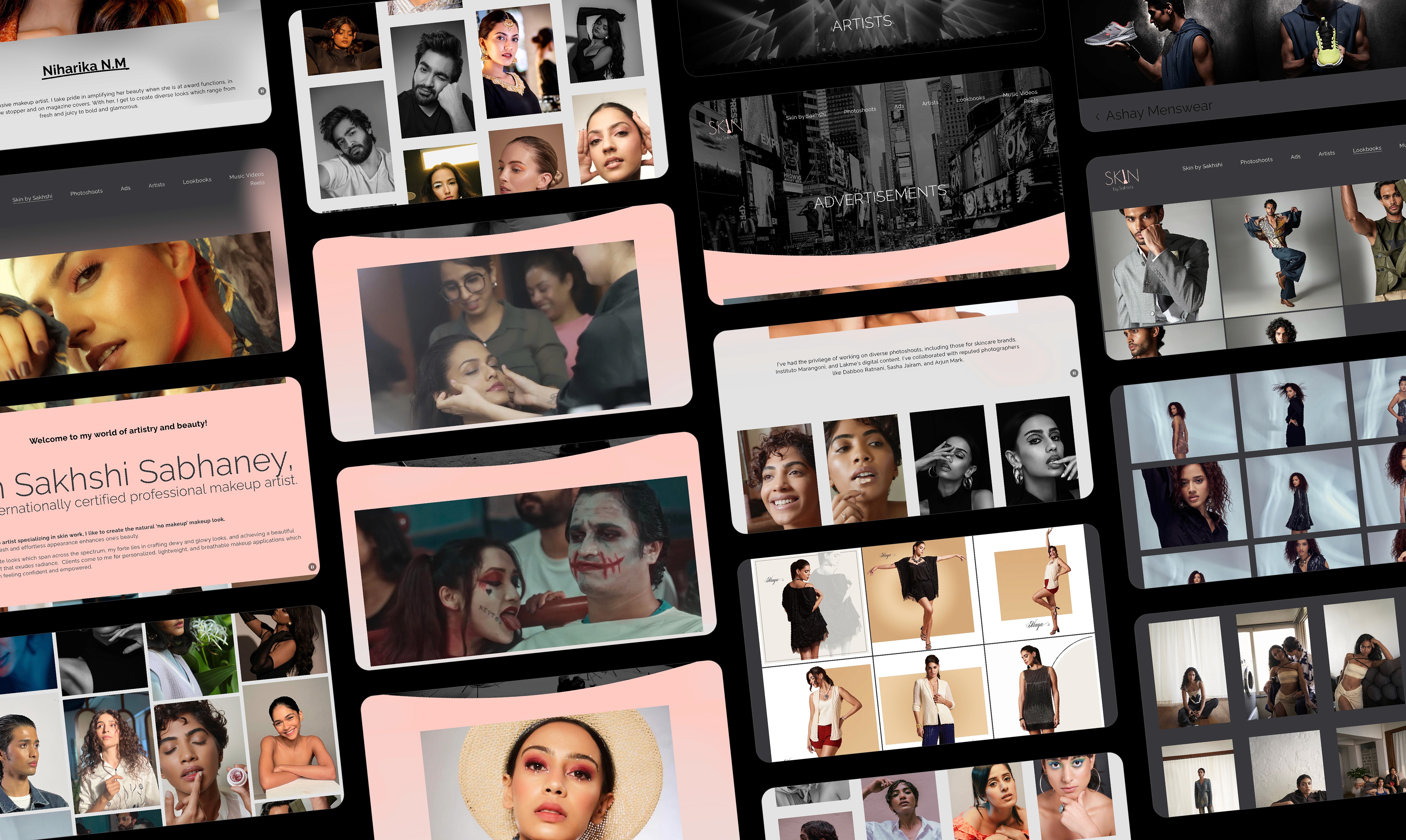
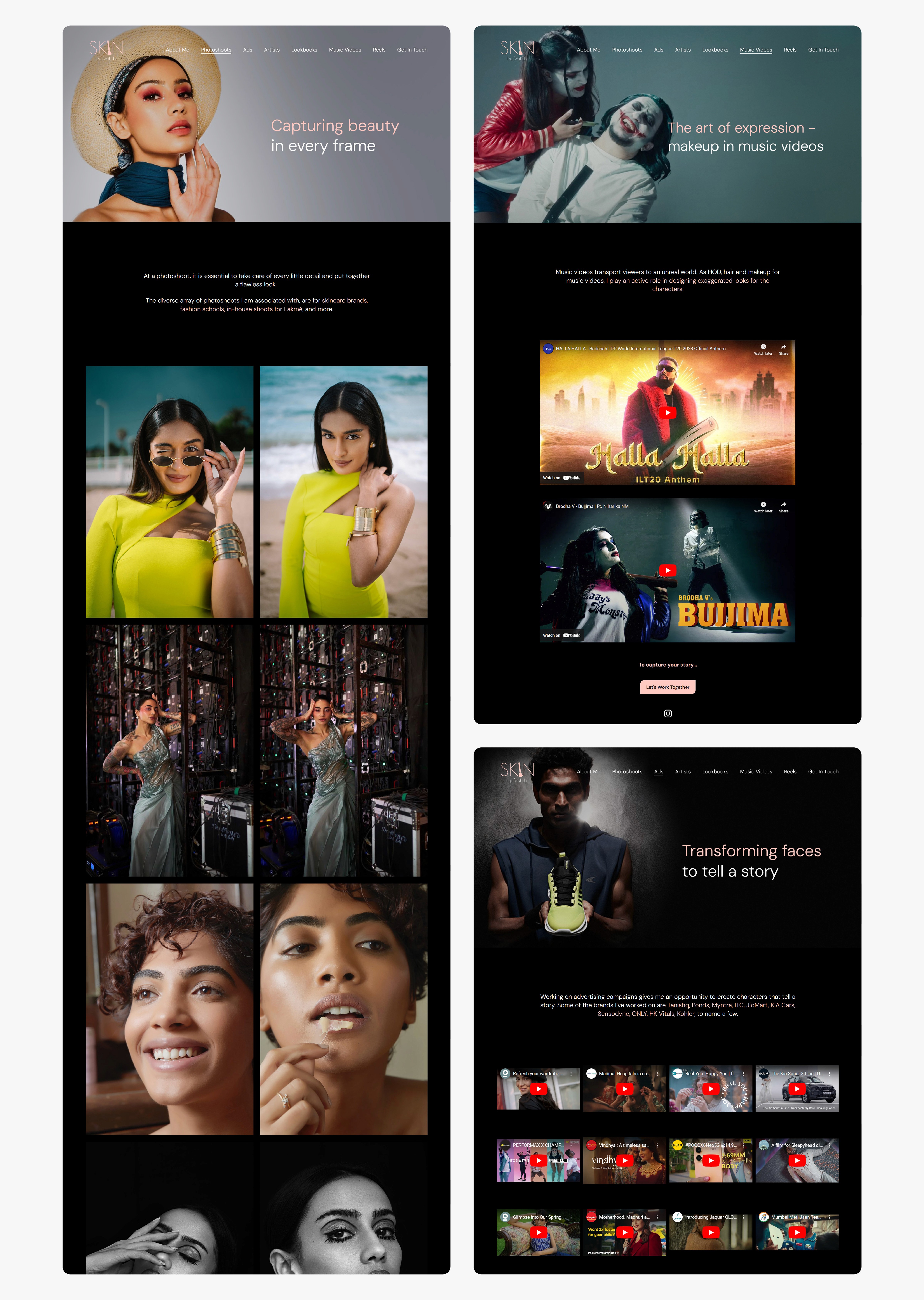
Introducing ‘Skin by Sakhshi’
Introducing ‘Skin by Sakhshi’
Introducing ‘Skin by Sakhshi’
The redesigned website provides a visually compelling and user-friendly experience. Key features include:
- Showcase of Diverse Work:
A well-organized portfolio that highlights Sakhshi's range of skills and experience across different categories (photoshoots, ads, music videos, reels, lookbooks).
- Simplified Contact Process:
A clear and accessible contact form that makes it easy for potential clients to get in touch.
- Consistent Branding:
A design system that ensures a cohesive and professional look and feel throughout the website.
https://www.skinbysakhshi.com/


Remote Usability Testing
Remote Usability Testing
Remote Usability Testing
Since the Design Thinking Cycle is an iterative process rather than a linear one, it allows for flexibility to revisit earlier stages for refinement. However, for clarity and presentation, I have outlined the process here in alignment with the UX Framework, even though usability testing occurred across multiple stages.
Through phone calls, remote sessions, and in-person usability testing with Sakhshi and a select group of users, I gathered valuable insights, particularly regarding navigation and content presentation.
For instance, on the ‘Ads’ page, users were less likely to engage with subpages when content was further categorized. Instead, they preferred seeing all ads in one place, as their categorization preferences varied—some preferred sorting by industry, others preferred organizing ads by the actors featured, and Sakhshi preferred sorting by the quality of her work. As a result, all ads were consolidated on a single page. This also aligned with Sakhshi’s goal of making her portfolio appear more extensive. Breaking content into subpages based on categories would have unintentionally made her body of work seem smaller.
LOOKING AHEAD
LOOKING AHEAD
LOOKING AHEAD
Project Takeaways
Project Takeaways
Project Takeaways
This project reinforced the critical role of fundamental design principles in creating effective and user-centric digital experiences. I found that simplicity and consistency in the visual structure directly contributed to improved usability and fostered greater user confidence. Furthermore, empathy for users, driven by thorough research, was paramount in designinga website that felt both aesthetically pleasing and highly functional, meeting diverse user needs.
This project reinforced the critical role of fundamental design principles in creating effective and user-centric digital experiences. I found that simplicity and consistency in the visual structure directly contributed to improved usability and fostered greater user confidence. Furthermore, empathy for users, driven by thorough research, was paramount in designinga website that felt both aesthetically pleasing and highly functional, meeting diverse user needs.
This project reinforced the critical role of fundamental design principles in creating effective and user-centric digital experiences. I found that simplicity and consistency in the visual structure directly contributed to improved usability and fostered greater user confidence. Furthermore, empathy for users, driven by thorough research, was paramount in designinga website that felt both aesthetically pleasing and highly functional, meeting diverse user needs.
The Importance of Methodology Over Tools
The Importance of Methodology Over Tools
The Importance of Methodology Over Tools
While the use of WYSIWYG website builders might suggest a purely visual design process, this project underscored the value of using design methodology. This involves conducting proper user research to inform design decisions and adhering to guiding design principles. The exploration of navigation options guided by user feedback, demonstrated how a methodological approach can lead to solutions that prioritize user needs over initial assumptions, ultimately enhancing clarity and accessibility.
While the use of WYSIWYG website builders might suggest a purely visual design process, this project underscored the value of using design methodology. This involves conducting proper user research to inform design decisions and adhering to guiding design principles. The exploration of navigation options guided by user feedback, demonstrated how a methodological approach can lead to solutions that prioritize user needs over initial assumptions, ultimately enhancing clarity and accessibility.
While the use of WYSIWYG website builders might suggest a purely visual design process, this project underscored the value of using design methodology. This involves conducting proper user research to inform design decisions and adhering to guiding design principles. The exploration of navigation options guided by user feedback, demonstrated how a methodological approach can lead to solutions that prioritize user needs over initial assumptions, ultimately enhancing clarity and accessibility.
Other Projects Other Projects Other Projects
